

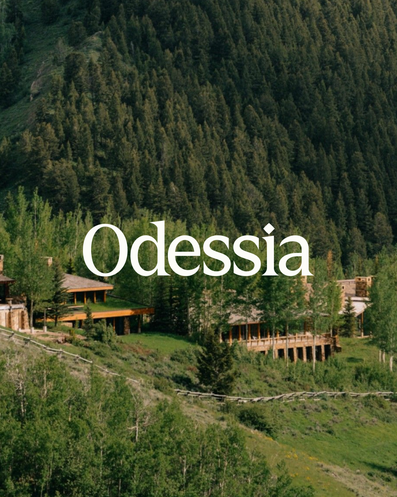
Odessia
Odessia is an AI travel agent that plans and books entire trips in a single conversation. Francis Davidson, co-founder of Sonder, built it around a specific belief: that the trip you imagine and the trip you take shouldn't be two different things. We helped Francis and his team bring the whole world to life, from the name to the product.
The name came before everything else. It had to feel like it had always existed.
The brief had a particular quality of ambition. Francis wasn't building another search tool with a chat interface bolted on. He wanted something that felt genuinely different from the OTAs, the aggregators, the AI wrappers that show you options but never actually help. The question we kept coming back to wasn't what the product does. It was who it is.
Her face has been on coins and temples. It felt right to put her on an app.
The name Odessia comes from a fictional Greek goddess of travel, one who covers the whole arc of it: the desire to go, the dawning clarity of what you actually want, the pleasure of the trip itself, and the memories that outlast it. She's been everywhere, which means she has taste without pretension. That character became the foundation for every decision that followed.
The wordmark draws from engraved Greek letterforms. It's designed to feel like it was always there.
We drew the wordmark from classical Greek inscription traditions, balancing geometric precision with a humanist touch that keeps it from feeling cold or purely historical. Her face, laurel-crowned, sits at the center of the mark. The full lockup reads as timeless without being precious about it.
The coins were one of those ideas that gets better every time you look at it.
The coin system came directly from the mythology. Inspired by ancient Greek currency, each coin is animated and sculptural, designed to spin and catch light when a traveler hits a milestone or completes a trip. They live in the product as achievement markers, which means the brand motif and the product interaction are the same thing. Warm clay and gold tones throughout, balanced against deep ocean blue.
Gouache and watercolor, loose and expressive. Moments collected along a journey.
The illustration system draws from travel journals, rendered in gouache and watercolor with soft washes and organic edges. The style sits between memory and documentation, the way a sketch you made on a terrace in Lisbon feels different from a photograph of the same view. It gives the brand visual range beyond the interface and the mark.
This is what the product actually does. One message, one trip, ready to go.
For the product, we designed a conversational interface that leads with destinations, not technology. The experience puts imagery and place first; the AI reasoning stays out of the way until it has something specific to show. One conversation handles flights, hotels, itineraries, loyalty points, and booking from start to finish.
"Not a travel site. A travel agent." The line that draws the right distinction.
The interface had to feel warm and considered, not utilitarian. We designed a thin, minimalist icon system with a subtle embossed, paper-like depth that integrates into the UI without competing with destination imagery. The conversational flow is built around the traveler's preferences accumulating over time, so every trip gets easier to plan than the last.
The moment the brand and the product become the same thing.
The Odessia Collection adds 2,000+ luxury properties with VIP treatment built in: upgrades, credits, early check-in, for travelers who don't have a personal assistant but travel like they do. The achievement system marks the milestones along the way, from first booking to explorer status, each one a coin spinning against the places you've been.
The product at the end of the flow. Trip planned, booked, and beautiful.
The NYC billboard campaign launched alongside the product, posing travel riddles in the streets and awarding trips to solvers. It was a clean expression of the brand's confidence: Odessia knows travel well enough to play with it. The identity held across everything, from the billboard serif to the product interface to the coin spinning on your phone when you land somewhere new.
See the full experience at odessia.com.

Little Plains Team
- Caroline Bel-Kher
- Product Management Director
- Guy Vempati
- Creative Product Manager
- Annie Swanson
- Creative Product Manager
- Avery Houser
- Strategy Director
- Rani Vestal
- Brand Designer
- Devin Cooper
- Brand Designer
- Paige Libadisos
- Product Designer
- Mia Feitel
- UI/UX Designer
- Sanghee Han
- UI/UX Designer
- Nicole Fernandez
- Copy Director
- Emmett Shine
- Creative Director
- Alex Leiphart
- Director of Product
- Michelle Riis
- Account Manager
- Laura Romero
- Operations