

Conception
Conception is a stem cell biology company working to turn human cells into eggs. We built their brand strategy, identity, visual system, and launch website. We also hired one of our moms to paint it.
Some of the most important work happening in science right now doesn't look the way science usually looks. Conception is building the technology to turn a blood cell into a human egg. That sentence is worth sitting with. It means age limits, biology limits, and circumstance limits all become negotiable. The implications are enormous and the science is genuinely hard. Getting both of those things across, honestly and without hype, was the challenge.
Matthew Krisiloff and his team came to us with years of foundational research behind them, a clear sense of what they were building, and a communications problem: the work was too easy to sensationalize, too easy to dismiss, and too easy to misunderstand. They needed a brand that could hold all of it.
The brand had to speak to three very different audiences at once. Scientists, who want rigor and proof, not promises. Investors and regulators, who need credibility signals and milestone clarity. And future patients, people who are vulnerable, hopeful, and deserve honesty above all. These audiences don't read the same way. They don't trust the same signals. The visual and verbal system had to work across all of them without flattening the message for any of them.
We also came in post-Theranos. The entire sector carries that weight. Every design decision, every word choice, had to be calibrated against a baseline of earned skepticism. The answer wasn't to go cold and clinical. It has to be warm and precise at the same time.
The creative answer started with a phone call to my mom.
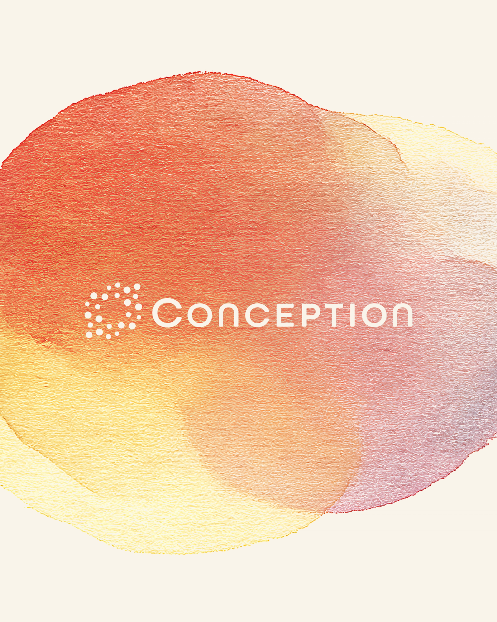
Emmett's mother is a professional painter. We asked her to create original watercolor compositions for the project, textures, color fields, and abstract washes that we could then bring into generative workflows. She painted through the palette: the warm oranges and mustards, the soft reds and blushes, the occasional lilac. She scanned them as she went. The Little Plains team took those originals into custom node-based generative pipelines, iterating, compositing, building new scenes, getting feedback, repeating.
The result is a visual system that is genuinely handmade at its root. No matter how far generative tools scale it, the origin stays human. That felt exactly right for a company whose entire mission is about human possibility.
The illustration style does what photography couldn't. Photography of stem cell biology is real and important, but it reads cold: microscopy images, lab equipment, technical detail. Watercolor puts you somewhere else entirely. It puts you in the feeling of what this work is for. A parent lifting a child. A family together. The warmth of what becomes possible.
The generative workflow let us build volume, dozens of compositions, variations, motion treatments, while keeping every output anchored to the original painted material. It's a model we're now developing further: hire artists first, use generative tools to extend what they make, never lose the human origin.
The color system is primary navy and cream, with illustration colors, orange, mustard, light yellow, blush, lilac, reserved for the watercolor work. PP Museum for headlines, carrying a classical confidence. Graphik for secondary type, keeping it modern and clean. The typographic and color system together signal institutional seriousness without institutional coldness.
Typography: PP Museum for display, Graphik for body. Color: Navy (#242A40) and Cream (#F8F4EB) as the structural palette. Illustration palette drawn directly from the painted originals.
The website is built around a single organizing discipline: never overclaim. Every section, hero, mission, science, ethics, team, and blog is designed to show progress without announcing arrival. The blog is the proof engine: updates, milestones, team perspectives. The science section layers clarity first, depth optional. The team section leans hard into credibility because if you've got it, you should use it.
The "Learn More" button, soft, rounded, warm, is a small detail that says a lot. Nothing sharp. Nothing aggressive. An invitation.
Conception launched with a brand that can hold the weight of what they're actually doing. Warm enough for patients. Rigorous enough for scientists. Clear enough for everyone else. And made, at its heart, by a painter in her studio.

Little Plains Team
- Caroline Bel-Kher
- Product Management Director
- Sanghee Han
- UI/UX Design
- Melanie Levitin
- Brand Strategy & Copy
- Nicole Fernandez
- Copy Director
- Sky Seo
- AI Art Director
- Juliyen Davis
- AI Art Director
- Katie Sims
- Brand Strategy & Copy
- Alex Coven
- Brand Design
- Elliot Robinson
- Motion Director
- Mads McCausland
- Motion Designer
- Fabrizzio Zampieri
- Developer
- Phillip McClure
- Graphic Design
- Andrea Shine
- Watercolor
- Emmett Shine
- Creative Director
- Alex Leiphart
- Head of Product
- Michelle Riis
- Account Manager
- Laura Romero
- Operations